b
props.children and proptypes
Displaying the login form only when appropriate
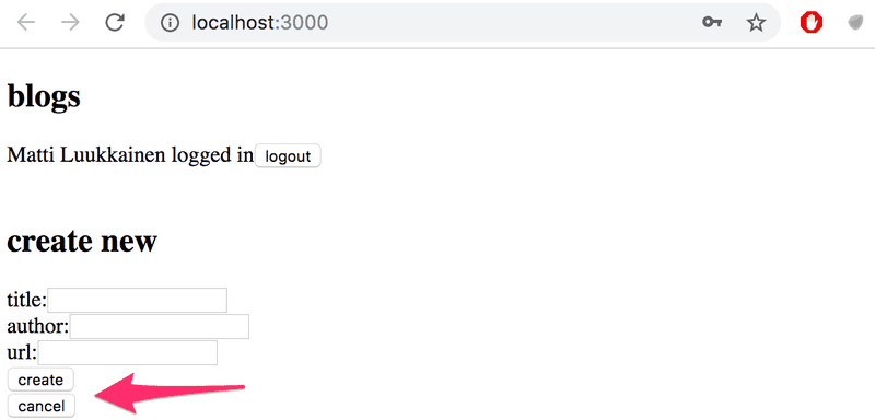
Let's modify the application so that the login form is not displayed by default:
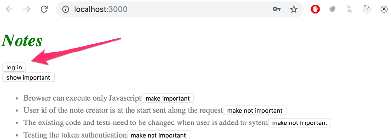
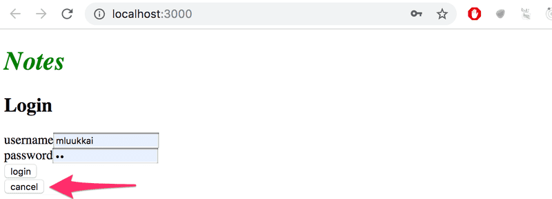
The login form appears when the user presses the login button:
The user can close the login form by clicking the cancel button.
Let's start by extracting the login form into its own component:
const LoginForm = ({
   handleSubmit,
   handleUsernameChange,
   handlePasswordChange,
   username,
   password
  }) => {
  return (
    <div>
      <h2>Login</h2>

      <form onSubmit={handleSubmit}>
        <div>
          username
          <input
            value={username}
            onChange={handleUsernameChange}
          />
        </div>
        <div>
          password
          <input
            type="password"
            value={password}
            onChange={handlePasswordChange}
          />
      </div>
        <button type="submit">login</button>
      </form>
    </div>
  )
}

export default LoginForm
The state and all the functions related to it are defined outside of the component and are passed to the component as props.
Notice that the props are assigned to variables through destructuring, which means that instead of writing:
const LoginForm = (props) => {
  return (
    <div>
      <h2>Login</h2>
      <form onSubmit={props.handleSubmit}>
        <div>
          username
          <input
            value={props.username}
            onChange={props.handleChange}
            name="username"
          />
        </div>
        // ...
        <button type="submit">login</button>
      </form>
    </div>
  )
}
where the properties of the props object are accessed through e.g. props.handleSubmit, the properties are assigned directly to their own variables.
One fast way of implementing the functionality is to change the loginForm function of the App component like so:
const App = () => {
  const [loginVisible, setLoginVisible] = useState(false)
  // ...

  const loginForm = () => {
    const hideWhenVisible = { display: loginVisible ? 'none' : '' }
    const showWhenVisible = { display: loginVisible ? '' : 'none' }

    return (
      <div>
        <div style={hideWhenVisible}>
          <button onClick={() => setLoginVisible(true)}>log in</button>
        </div>
        <div style={showWhenVisible}>
          <LoginForm
            username={username}
            password={password}
            handleUsernameChange={({ target }) => setUsername(target.value)}
            handlePasswordChange={({ target }) => setPassword(target.value)}
            handleSubmit={handleLogin}
          />
          <button onClick={() => setLoginVisible(false)}>cancel</button>
        </div>
      </div>
    )
  }

  // ...
}
The App component state now contains the boolean loginVisible, which defines if the login form should be shown to the user or not.
The value of loginVisible is toggled with two buttons. Both buttons have their event handlers defined directly in the component:
<button onClick={() => setLoginVisible(true)}>log in</button>

<button onClick={() => setLoginVisible(false)}>cancel</button>
The visibility of the component is defined by giving the component an inline style rule, where the value of the display property is none if we do not want the component to be displayed:
const hideWhenVisible = { display: loginVisible ? 'none' : '' }
const showWhenVisible = { display: loginVisible ? '' : 'none' }

<div style={hideWhenVisible}>
  // button
</div>

<div style={showWhenVisible}>
  // button
</div>
We are once again using the "question mark" ternary operator. If loginVisible is true, then the CSS rule of the component will be:
display: 'none';If loginVisible is false, then display will not receive any value related to the visibility of the component.
The components children, aka. props.children
The code related to managing the visibility of the login form could be considered to be its own logical entity, and for this reason, it would be good to extract it from the App component into a separate component.
Our goal is to implement a new Togglable component that can be used in the following way:
<Togglable buttonLabel='login'>
  <LoginForm
    username={username}
    password={password}
    handleUsernameChange={({ target }) => setUsername(target.value)}
    handlePasswordChange={({ target }) => setPassword(target.value)}
    handleSubmit={handleLogin}
  />
</Togglable>
The way that the component is used is slightly different from our previous components. The component has both opening and closing tags that surround a LoginForm component. In React terminology LoginForm is a child component of Togglable.
We can add any React elements we want between the opening and closing tags of Togglable, like this for example:
<Togglable buttonLabel="reveal">
  <p>this line is at start hidden</p>
  <p>also this is hidden</p>
</Togglable>
The code for the Togglable component is shown below:
import { useState } from 'react'

const Togglable = (props) => {
  const [visible, setVisible] = useState(false)

  const hideWhenVisible = { display: visible ? 'none' : '' }
  const showWhenVisible = { display: visible ? '' : 'none' }

  const toggleVisibility = () => {
    setVisible(!visible)
  }

  return (
    <div>
      <div style={hideWhenVisible}>
        <button onClick={toggleVisibility}>{props.buttonLabel}</button>
      </div>
      <div style={showWhenVisible}>
        {props.children}
        <button onClick={toggleVisibility}>cancel</button>
      </div>
    </div>
  )
}

export default Togglable
The new and interesting part of the code is props.children, which is used for referencing the child components of the component. The child components are the React elements that we define between the opening and closing tags of a component.
This time the children are rendered in the code that is used for rendering the component itself:
<div style={showWhenVisible}>
  {props.children}
  <button onClick={toggleVisibility}>cancel</button>
</div>
Unlike the "normal" props we've seen before, children is automatically added by React and always exists. If a component is defined with an automatically closing /> tag, like this:
<Note
  key={note.id}
  note={note}
  toggleImportance={() => toggleImportanceOf(note.id)}
/>
Then props.children is an empty array.
The Togglable component is reusable and we can use it to add similar visibility toggling functionality to the form that is used for creating new notes.
Before we do that, let's extract the form for creating notes into a component:
const NoteForm = ({ onSubmit, handleChange, value}) => {
  return (
    <div>
      <h2>Create a new note</h2>

      <form onSubmit={onSubmit}>
        <input
          value={value}
          onChange={handleChange}
        />
        <button type="submit">save</button>
      </form>
    </div>
  )
}
Next let's define the form component inside of a Togglable component:
<Togglable buttonLabel="new note">
  <NoteForm
    onSubmit={addNote}
    value={newNote}
    handleChange={handleNoteChange}
  />
</Togglable>
You can find the code for our current application in its entirety in the part5-4 branch of this GitHub repository.
State of the forms
The state of the application currently is in the App component.
React documentation says the following about where to place the state:
Sometimes, you want the state of two components to always change together. To do it, remove state from both of them, move it to their closest common parent, and then pass it down to them via props. This is known as lifting state up, and it’s one of the most common things you will do writing React code.
If we think about the state of the forms, so for example the contents of a new note before it has been created, the App component does not need it for anything. We could just as well move the state of the forms to the corresponding components.
The component for creating a new note changes like so:
import { useState } from 'react'

const NoteForm = ({ createNote }) => {
  const [newNote, setNewNote] = useState('')

  const addNote = (event) => {
    event.preventDefault()
    createNote({
      content: newNote,
      important: true
    })

    setNewNote('')
  }

  return (
    <div>
      <h2>Create a new note</h2>

      <form onSubmit={addNote}>
        <input
          value={newNote}
          onChange={event => setNewNote(event.target.value)}
        />
        <button type="submit">save</button>
      </form>
    </div>
  )
}

export default NoteForm
NOTE At the same time, we changed the behavior of the application so that new notes are important by default, i.e. the field important gets the value true.
The newNote state variable and the event handler responsible for changing it have been moved from the App component to the component responsible for the note form.
There is only one prop left, the createNote function, which the form calls when a new note is created.
The App component becomes simpler now that we have got rid of the newNote state and its event handler. The addNote function for creating new notes receives a new note as a parameter, and the function is the only prop we send to the form:
const App = () => {
  // ...
  const addNote = (noteObject) => {    noteService
      .create(noteObject)
      .then(returnedNote => {
        setNotes(notes.concat(returnedNote))
      })
  }
  // ...
  const noteForm = () => (
    <Togglable buttonLabel='new note'>
      <NoteForm createNote={addNote} />
    </Togglable>
  )

  // ...
}
We could do the same for the log in form, but we'll leave that for an optional exercise.
The application code can be found on GitHub, branch part5-5.
References to components with ref
Our current implementation is quite good; it has one aspect that could be improved.
After a new note is created, it would make sense to hide the new note form. Currently, the form stays visible. There is a slight problem with hiding it, the visibility is controlled with the visible state variable inside of the Togglable component.
One solution to this would be to move control of the Togglable component's state outside the component. However, we won't do that now, because we want the component to be responsible for its own state. So we have to find another solution, and find a mechanism to change the state of the component externally.
There are several different ways to implement access to a component's functions from outside the component, but let's use the ref mechanism of React, which offers a reference to the component.
Let's make the following changes to the App component:
import { useState, useEffect, useRef } from 'react'
const App = () => {
  // ...
  const noteFormRef = useRef()
  const noteForm = () => (
    <Togglable buttonLabel='new note' ref={noteFormRef}>      <NoteForm createNote={addNote} />
    </Togglable>
  )

  // ...
}
The useRef hook is used to create a noteFormRef reference, that is assigned to the Togglable component containing the creation note form. The noteFormRef variable acts as a reference to the component. This hook ensures that the same reference (ref) is kept throughout re-renders of the component.
We also make the following changes to the Togglable component:
import { useState, useImperativeHandle } from 'react'
const Togglable = (props) => {  const [visible, setVisible] = useState(false)

  const hideWhenVisible = { display: visible ? 'none' : '' }
  const showWhenVisible = { display: visible ? '' : 'none' }

  const toggleVisibility = () => {
    setVisible(!visible)
  }

  useImperativeHandle(props.ref, () => {    return { toggleVisibility }  })
  return (
    <div>
      <div style={hideWhenVisible}>
        <button onClick={toggleVisibility}>{props.buttonLabel}</button>
      </div>
      <div style={showWhenVisible}>
        {props.children}
        <button onClick={toggleVisibility}>cancel</button>
      </div>
    </div>
  )
}

export default Togglable
The component uses the useImperativeHandle hook to make its toggleVisibility function available outside of the component.
We can now hide the form by calling noteFormRef.current.toggleVisibility() after a new note has been created:
const App = () => {
  // ...
  const addNote = (noteObject) => {
    noteFormRef.current.toggleVisibility()    noteService
      .create(noteObject)
      .then(returnedNote => {
        setNotes(notes.concat(returnedNote))
      })
  }
  // ...
}
To recap, the useImperativeHandle function is a React hook, that is used for defining functions in a component, which can be invoked from outside of the component.
This trick works for changing the state of a component, but it looks a bit unpleasant. We could have accomplished the same functionality with slightly cleaner code using "old React" class-based components. We will take a look at these class components during part 7 of the course material. So far this is the only situation where using React hooks leads to code that is not cleaner than with class components.
There are also other use cases for refs than accessing React components.
You can find the code for our current application in its entirety in the part5-6 branch of this GitHub repository.
One point about components
When we define a component in React:
const Togglable = () => ...
  // ...
}
And use it like this:
<div>
  <Togglable buttonLabel="1" ref={togglable1}>
    first
  </Togglable>

  <Togglable buttonLabel="2" ref={togglable2}>
    second
  </Togglable>

  <Togglable buttonLabel="3" ref={togglable3}>
    third
  </Togglable>
</div>
We create three separate instances of the component that all have their separate state:
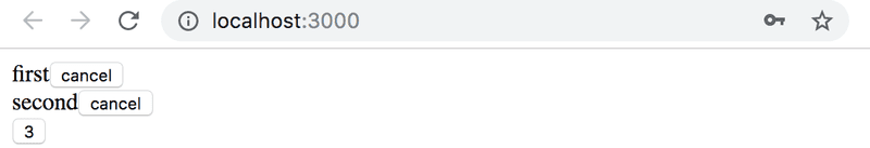
The ref attribute is used for assigning a reference to each of the components in the variables togglable1, togglable2 and togglable3.
The updated full stack developer's oath
The number of moving parts increases. At the same time, the likelihood of ending up in a situation where we are looking for a bug in the wrong place increases. So we need to be even more systematic.
So we should once more extend our oath:
Full stack development is extremely hard, that is why I will use all the possible means to make it easier
- I will have my browser developer console open all the time
- I will use the network tab of the browser dev tools to ensure that frontend and backend are communicating as I expect
- I will constantly keep an eye on the state of the server to make sure that the data sent there by the frontend is saved there as I expect
- I will keep an eye on the database: does the backend save data there in the right format
- I progress with small steps
- when I suspect that there is a bug in the frontend, I'll make sure that the backend works as expected
- when I suspect that there is a bug in the backend, I'll make sure that the frontend works as expected
- I will write lots of console.log statements to make sure I understand how the code and the tests behave and to help pinpoint problems
- If my code does not work, I will not write more code. Instead, I'll start deleting it until it works or will just return to a state where everything was still working
- If a test does not pass, I'll make sure that the tested functionality works properly in the application
- When I ask for help in the course Discord channel or elsewhere I formulate my questions properly, see here how to ask for help
Exercises 5.5.-5.11.
5.5 Blog List Frontend, step 5
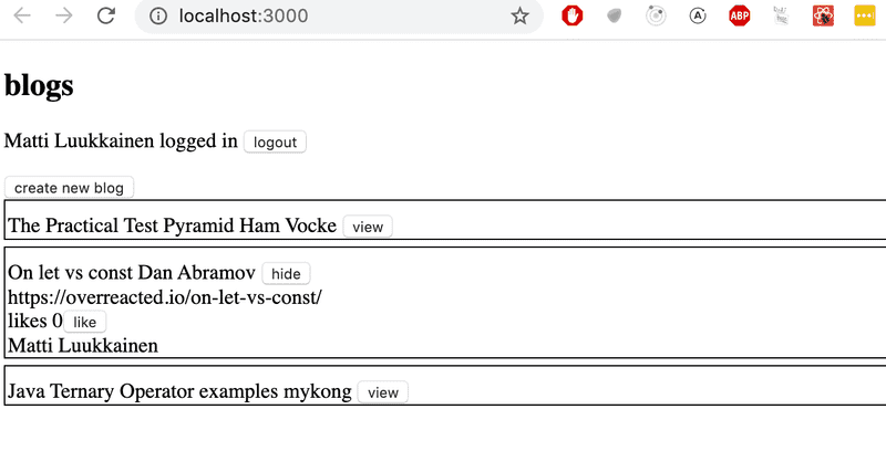
Change the form for creating blog posts so that it is only displayed when appropriate. Use functionality similar to what was shown earlier in this part of the course material. If you wish to do so, you can use the Togglable component defined in part 5.
By default the form is not visible
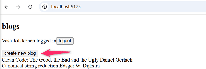
It expands when button create new blog is clicked
The form hides again after a new blog is created or the cancel button is pressed.
5.6 Blog List Frontend, step 6
Separate the form for creating a new blog into its own component (if you have not already done so), and move all the states required for creating a new blog to this component.
The component must work like the NoteForm component from the material of this part.
5.7 Blog List Frontend, step 7
Let's add a button to each blog, which controls whether all of the details about the blog are shown or not.
Full details of the blog open when the button is clicked.
And the details are hidden when the button is clicked again.
At this point, the like button does not need to do anything.
The application shown in the picture has a bit of additional CSS to improve its appearance.
It is easy to add styles to the application as shown in part 2 using inline styles:
const Blog = ({ blog }) => {
  const blogStyle = {
    paddingTop: 10,
    paddingLeft: 2,
    border: 'solid',
    borderWidth: 1,
    marginBottom: 5
  }

  return (
    <div style={blogStyle}>      <div>
        {blog.title} {blog.author}
      </div>
      // ...
  </div>
)}
NB: Even though the functionality implemented in this part is almost identical to the functionality provided by the Togglable component, it can't be used directly to achieve the desired behavior. The easiest solution would be to add a state to the blog component that controls if the details are being displayed or not.
5.8: Blog List Frontend, step 8
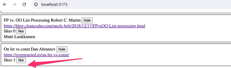
Implement the functionality for the like button. Likes are increased by making an HTTP PUT request to the unique address of the blog post in the backend.
Since the backend operation replaces the entire blog post, you will have to send all of its fields in the request body. If you wanted to add a like to the following blog post:
{
  _id: "5a43fde2cbd20b12a2c34e91",
  user: {
    _id: "5a43e6b6c37f3d065eaaa581",
    username: "mluukkai",
    name: "Matti Luukkainen"
  },
  likes: 0,
  author: "Joel Spolsky",
  title: "The Joel Test: 12 Steps to Better Code",
  url: "https://www.joelonsoftware.com/2000/08/09/the-joel-test-12-steps-to-better-code/"
},
You would have to make an HTTP PUT request to the address /api/blogs/5a43fde2cbd20b12a2c34e91 with the following request data:
{
  user: "5a43e6b6c37f3d065eaaa581",
  likes: 1,
  author: "Joel Spolsky",
  title: "The Joel Test: 12 Steps to Better Code",
  url: "https://www.joelonsoftware.com/2000/08/09/the-joel-test-12-steps-to-better-code/"
}
The backend has to be updated too to handle the user reference.
5.9: Blog List Frontend, step 9
We notice that something is wrong. When a blog is liked in the app, the name of the user that added the blog is not shown in its details:
When the browser is reloaded, the information of the person is displayed. This is not acceptable, find out where the problem is and make the necessary correction.
Of course, it is possible that you have already done everything correctly and the problem does not occur in your code. In that case, you can move on.
5.10: Blog List Frontend, step 10
Modify the application to sort the blog posts by the number of likes. The Sorting can be done with the array sort method.
5.11: Blog List Frontend, step 11
Add a new button for deleting blog posts. Also, implement the logic for deleting blog posts in the frontend.
Your application could look something like this:
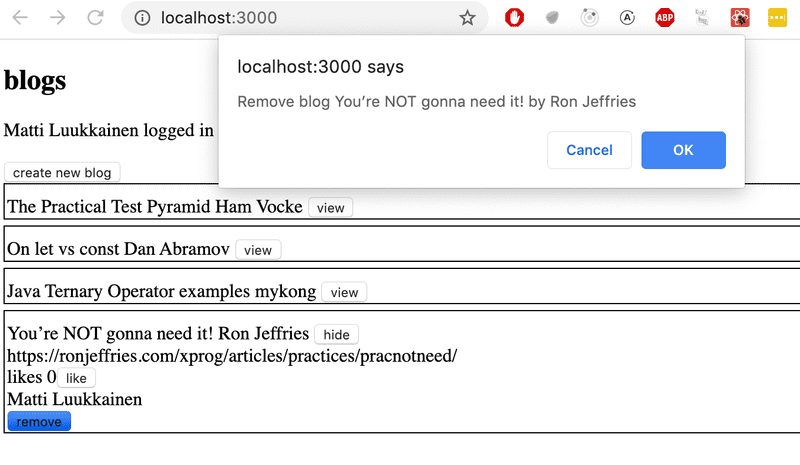
The confirmation dialog for deleting a blog post is easy to implement with the window.confirm function.
Show the button for deleting a blog post only if the blog post was added by the user.
ESlint
In part 3 we configured the ESlint code style tool to the backend. Let's take ESlint to use in the frontend as well.
Vite has installed ESlint to the project by default, so all that's left for us to do is define our desired configuration in the eslint.config.js file.
Let's create a eslint.config.js file with the following contents:
import js from '@eslint/js'
import globals from 'globals'
import reactHooks from 'eslint-plugin-react-hooks'
import reactRefresh from 'eslint-plugin-react-refresh'

export default [
  { ignores: ['dist'] },
  {
    files: ['**/*.{js,jsx}'],
    languageOptions: {
      ecmaVersion: 2020,
      globals: globals.browser,
      parserOptions: {
        ecmaVersion: 'latest',
        ecmaFeatures: { jsx: true },
        sourceType: 'module'
      }
    },
    plugins: {
      'react-hooks': reactHooks,
      'react-refresh': reactRefresh
    },
    rules: {
      ...js.configs.recommended.rules,
      ...reactHooks.configs.recommended.rules,
      'no-unused-vars': ['error', { varsIgnorePattern: '^[A-Z_]' }],
      'react-refresh/only-export-components': [
        'warn',
        { allowConstantExport: true }
      ],      indent: ['error', 2],      'linebreak-style': ['error', 'unix'],      quotes: ['error', 'single'],      semi: ['error', 'never'],      eqeqeq: 'error',      'no-trailing-spaces': 'error',      'object-curly-spacing': ['error', 'always'],      'arrow-spacing': ['error', { before: true, after: true }],      'no-console': 'off'    }
  }
]
NOTE: If you are using Visual Studio Code together with ESLint plugin, you might need to add a workspace setting for it to work. If you are seeing Failed to load plugin react: Cannot find module 'eslint-plugin-react' additional configuration is needed. Adding the following line to settings.json may help:
"eslint.workingDirectories": [{ "mode": "auto" }]See here for more information.
As usual, you can perform the linting either from the command line with the command
npm run lintor using the editor's Eslint plugin.
You can find the code for our current application in its entirety in the part5-7 branch of this GitHub repository.