b
React Native basics
Now that we have set up our development environment we can get into React Native basics and get started with the development of our application. In this section, we will learn how to build user interfaces with React Native's core components, how to add style properties to these core components, how to transition between views, and how to manage the form's state efficiently.
Core components
In the previous parts, we have learned that we can use React to define components as functions, which receive props as an argument and returns a tree of React elements. This tree is usually represented with JSX syntax. In the browser environment, we have used the ReactDOM library to turn these components into a DOM tree that can be rendered by a browser. Here is a concrete example of a very simple component:
const HelloWorld = props => {
  return <div>Hello world!</div>;
};
The HelloWorld component returns a single div element which is created using the JSX syntax. We might remember that this JSX syntax is compiled into React.createElement method calls, such as this:
React.createElement('div', null, 'Hello world!');This line of code creates a div element without any props and with a single child element which is a string "Hello world". When we render this component into a root DOM element using the ReactDOM.render method the div element will be rendered as the corresponding DOM element.
As we can see, React is not bound to a certain environment, such as the browser environment. Instead, there are libraries such as ReactDOM that can render a set of predefined components, such as DOM elements, in a specific environment. In React Native these predefined components are called core components.
Core components are a set of components provided by React Native, which behind the scenes utilize the platform's native components. Let's implement the previous example using React Native:
import { Text } from 'react-native';
const HelloWorld = props => {
  return <Text>Hello world!</Text>;};
So we import the Text component from React Native and replace the div element with a Text element. Many familiar DOM elements have their React Native "counterparts". Here are some examples picked from React Native's Core Components documentation:
- Text component is the only React Native component that can have textual children. It is similar to for example the <strong> and the <h1> elements.
- View component is the basic user interface building block similar to the <div> element.
- TextInput component is a text field component similar to the <input> element.
- Pressable component is for capturing different press events. It is similar to for example the <button> element.
There are a few notable differences between core components and DOM elements. The first difference is that the Text component is the only React Native component that can have textual children. This means that you can't, for example, replace the Text component with the View component in the previous example.
The second notable difference is related to the event handlers. While working with the DOM elements we are used to adding event handlers such as onClick to basically any element such as <div> and <button>. In React Native we have to carefully read the API documentation to know what event handlers (as well as other props) a component accepts. For example, the Pressable component provides props for listening to different kinds of press events. We can for example use the component's onPress prop for listening to press events:
import { Text, Pressable, Alert } from 'react-native';

const PressableText = props => {
  return (
    <Pressable
      onPress={() => Alert.alert('You pressed the text!')}
    >
      <Text>You can press me</Text>
    </Pressable>
  );
};
Now that we have a basic understanding of the core components, let's start to give our project some structure. Create a src directory in the root directory of your project and in the src directory create a components directory. In the components directory create a file Main.jsx with the following content:
import Constants from 'expo-constants';
import { Text, StyleSheet, View } from 'react-native';

const styles = StyleSheet.create({
  container: {
    marginTop: Constants.statusBarHeight,
    flexGrow: 1,
    flexShrink: 1,
  },
});

const Main = () => {
  return (
    <View style={styles.container}>
      <Text>Rate Repository Application</Text>
    </View>
  );
};

export default Main;
Next, let's use the Main component in the App component in the App.js file which is located in our project's root directory. Replace the current content of the file with this:
import Main from './src/components/Main';

const App = () => {
  return <Main />;
};

export default App;
Manually reloading the application
As we have seen, Expo will automatically reload the application when we make changes to the code. However, there might be times when automatic reload isn't working and the application has to be reloaded manually. This can be achieved through the in-app developer menu.
You can access the developer menu by shaking your device or by selecting "Shake Gesture" inside the Hardware menu in the iOS Simulator. You can also use the ⌘D keyboard shortcut when your app is running in the iOS Simulator, or ⌘M when running in an Android emulator on Mac OS and Ctrl+M on Windows and Linux.
Once the developer menu is open, simply press "Reload" to reload the application. After the application has been reloaded, automatic reloads should work without the need for a manual reload.
Exercise 10.3
Exercise 10.3: the reviewed repositories list
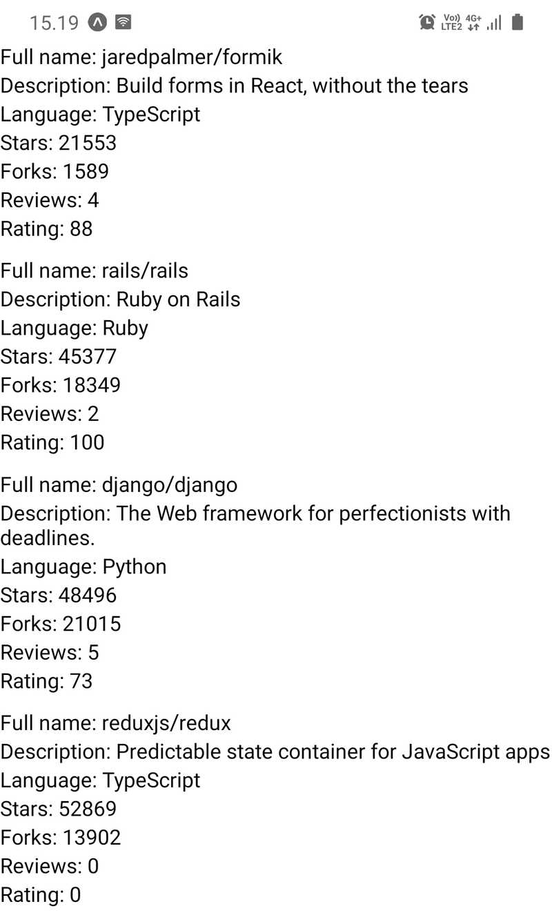
In this exercise, we will implement the first version of the reviewed repositories list. The list should contain the repository's full name, description, language, number of forks, number of stars, rating average and number of reviews. Luckily React Native provides a handy component for displaying a list of data, which is the FlatList component.
Implement components RepositoryList and RepositoryItem in the components directory's files RepositoryList.jsx and RepositoryItem.jsx. The RepositoryList component should render the FlatList component and RepositoryItem a single item on the list (hint: use the FlatList component's renderItem prop). Use this as the basis for the RepositoryList.jsx file:
import { FlatList, View, StyleSheet } from 'react-native';

const styles = StyleSheet.create({
  separator: {
    height: 10,
  },
});

const repositories = [
  {
    id: 'jaredpalmer.formik',
    fullName: 'jaredpalmer/formik',
    description: 'Build forms in React, without the tears',
    language: 'TypeScript',
    forksCount: 1589,
    stargazersCount: 21553,
    ratingAverage: 88,
    reviewCount: 4,
    ownerAvatarUrl: 'https://avatars2.githubusercontent.com/u/4060187?v=4',
  },
  {
    id: 'rails.rails',
    fullName: 'rails/rails',
    description: 'Ruby on Rails',
    language: 'Ruby',
    forksCount: 18349,
    stargazersCount: 45377,
    ratingAverage: 100,
    reviewCount: 2,
    ownerAvatarUrl: 'https://avatars1.githubusercontent.com/u/4223?v=4',
  },
  {
    id: 'django.django',
    fullName: 'django/django',
    description: 'The Web framework for perfectionists with deadlines.',
    language: 'Python',
    forksCount: 21015,
    stargazersCount: 48496,
    ratingAverage: 73,
    reviewCount: 5,
    ownerAvatarUrl: 'https://avatars2.githubusercontent.com/u/27804?v=4',
  },
  {
    id: 'reduxjs.redux',
    fullName: 'reduxjs/redux',
    description: 'Predictable state container for JavaScript apps',
    language: 'TypeScript',
    forksCount: 13902,
    stargazersCount: 52869,
    ratingAverage: 0,
    reviewCount: 0,
    ownerAvatarUrl: 'https://avatars3.githubusercontent.com/u/13142323?v=4',
  },
];

const ItemSeparator = () => <View style={styles.separator} />;

const RepositoryList = () => {
  return (
    <FlatList
      data={repositories}
      ItemSeparatorComponent={ItemSeparator}
      // other props
    />
  );
};

export default RepositoryList;
Do not alter the contents of the repositories variable, it should contain everything you need to complete this exercise. Render the RepositoryList component in the Main component which we previously added to the Main.jsx file. The reviewed repository list should roughly look something like this:
Style
Now that we have a basic understanding of how core components work and we can use them to build a simple user interface it is time to add some styles. In part 2 we learned that in the browser environment we can define React component's style properties using CSS. We had the option to either define these styles inline using the style prop or in a CSS file with a suitable selector.
There are many similarities in the way style properties are attached to React Native's core components and the way they are attached to DOM elements. In React Native most of the core components accept a prop called style. The style prop accepts an object with style properties and their values. These style properties are in most cases the same as in CSS, however, property names are in camelCase. This means that CSS properties such as padding-top and font-size are written as paddingTop and fontSize. Here is a simple example of how to use the style prop:
import { Text, View } from 'react-native';

const BigBlueText = () => {
  return (
    <View style={{ padding: 20 }}>
      <Text style={{ color: 'blue', fontSize: 24, fontWeight: '700' }}>
        Big blue text
      </Text>
    </View>
  );
};
On top of the property names, you might have noticed another difference in the example. In CSS numerical property values commonly have a unit such as px, %, em or rem. In React Native all dimension-related property values such as width, height, padding, and margin as well as font sizes are unitless. These unitless numeric values represent density-independent pixels. In case you are wondering what are the available style properties for certain core components, check the React Native Styling Cheat Sheet.
In general, defining styles directly in the style prop is not considered such a great idea, because it makes components bloated and unclear. Instead, we should define styles outside the component's render function using the StyleSheet.create method. The StyleSheet.create method accepts a single argument which is an object consisting of named style objects and it creates a StyleSheet style reference from the given object. Here is an example of how to refactor the previous example using the StyleSheet.create method:
import { Text, View, StyleSheet } from 'react-native';
const styles = StyleSheet.create({  container: {    padding: 20,  },  text: {    color: 'blue',    fontSize: 24,    fontWeight: '700',  },});
const BigBlueText = () => {
  return (
    <View style={styles.container}>      <Text style={styles.text}>        Big blue text
      </Text>
    </View>
  );
};
We create two named style objects, styles.container and styles.text. Inside the component, we can access specific style objects the same way we would access any key in a plain object.
In addition to an object, the style prop also accepts an array of objects. In the case of an array, the objects are merged from left to right so that latter-style properties take precedence. This works recursively, so we can have for example an array containing an array of styles and so forth. If an array contains values that evaluate to false, such as null or undefined, these values are ignored. This makes it easy to define conditional styles for example, based on the value of a prop. Here is an example of conditional styles:
import { Text, View, StyleSheet } from 'react-native';

const styles = StyleSheet.create({
  text: {
    color: 'grey',
    fontSize: 14,
  },
  blueText: {
    color: 'blue',
  },
  bigText: {
    fontSize: 24,
    fontWeight: '700',
  },
});

const FancyText = ({ isBlue, isBig, children }) => {
  const textStyles = [
    styles.text,
    isBlue && styles.blueText,
    isBig && styles.bigText,
  ];

  return <Text style={textStyles}>{children}</Text>;
};

const Main = () => {
  return (
    <>
      <FancyText>Simple text</FancyText>
      <FancyText isBlue>Blue text</FancyText>
      <FancyText isBig>Big text</FancyText>
      <FancyText isBig isBlue>
        Big blue text
      </FancyText>
    </>
  );
};
In the example, we use the && operator with the expression condition && exprIfTrue. This expression yields exprIfTrue if the condition evaluates to true, otherwise it will yield condition, which in that case is a value that evaluates to false. This is an extremely widely used and handy shorthand. Another option would be to use the conditional operator like this:
condition ? exprIfTrue : exprIfFalseConsistent user interface with theming
Let's stick with the concept of styling but with a bit wider perspective. Most of us have used a multitude of different applications and might agree that one trait that makes a good user interface is consistency. This means that the appearance of user interface components such as their font size, font family and color follows a consistent pattern. To achieve this we have to somehow parametrize the values of different style properties. This method is commonly known as theming.
Users of popular user interface libraries such as Bootstrap and Material UI might already be quite familiar with theming. Even though the theming implementations differ, the main idea is always to use variables such as colors.primary instead of "magic numbers" such as #0366d6 when defining styles. This leads to increased consistency and flexibility.
Let's see how theming could work in practice in our application. We will be using a lot of text with different variations, such as different font sizes and colors. Because React Native does not support global styles, we should create our own Text component to keep the textual content consistent. Let's get started by adding the following theme configuration object in a theme.js file in the src directory:
const theme = {
  colors: {
    textPrimary: '#24292e',
    textSecondary: '#586069',
    primary: '#0366d6',
  },
  fontSizes: {
    body: 14,
    subheading: 16,
  },
  fonts: {
    main: 'System',
  },
  fontWeights: {
    normal: '400',
    bold: '700',
  },
};

export default theme;
Next, we should create the actual Text component which uses this theme configuration. Create a Text.jsx file in the components directory where we already have our other components. Add the following content to the Text.jsx file:
import { Text as NativeText, StyleSheet } from 'react-native';

import theme from '../theme';

const styles = StyleSheet.create({
  text: {
    color: theme.colors.textPrimary,
    fontSize: theme.fontSizes.body,
    fontFamily: theme.fonts.main,
    fontWeight: theme.fontWeights.normal,
  },
  colorTextSecondary: {
    color: theme.colors.textSecondary,
  },
  colorPrimary: {
    color: theme.colors.primary,
  },
  fontSizeSubheading: {
    fontSize: theme.fontSizes.subheading,
  },
  fontWeightBold: {
    fontWeight: theme.fontWeights.bold,
  },
});

const Text = ({ color, fontSize, fontWeight, style, ...props }) => {
  const textStyle = [
    styles.text,
    color === 'textSecondary' && styles.colorTextSecondary,
    color === 'primary' && styles.colorPrimary,
    fontSize === 'subheading' && styles.fontSizeSubheading,
    fontWeight === 'bold' && styles.fontWeightBold,
    style,
  ];

  return <NativeText style={textStyle} {...props} />;
};

export default Text;
Now we have implemented our text component. This text component has consistent color, font size and font weight variants that we can use anywhere in our application. We can get different text variations using different props like this:
import Text from './Text';

const Main = () => {
  return (
    <>
      <Text>Simple text</Text>
      <Text style={{ paddingBottom: 10 }}>Text with custom style</Text>
      <Text fontWeight="bold" fontSize="subheading">
        Bold subheading
      </Text>
      <Text color="textSecondary">Text with secondary color</Text>
    </>
  );
};

export default Main;
Feel free to extend or modify this component if you feel like it. It might also be a good idea to create reusable text components such as Subheading which use the Text component. Also, keep on extending and modifying the theme configuration as your application progresses.
Using flexbox for layout
The last concept we will cover related to styling is implementing layouts with flexbox. Those who are more familiar with CSS know that flexbox is not related only to React Native, it has many use cases in web development as well. Those who know how flexbox works in web development won't probably learn that much from this section. Nevertheless, let's learn or revise the basics of flexbox.
Flexbox is a layout entity consisting of two separate components: a flex container and inside it a set of flex items. A Flex container has a set of properties that control the flow of its items. To make a component a flex container it must have the style property display set as flex which is the default value for the display property. Here is an example of a flex container:
import { View, StyleSheet } from 'react-native';

const styles = StyleSheet.create({
  flexContainer: {
    flexDirection: 'row',
  },
});

const FlexboxExample = () => {
  return <View style={styles.flexContainer}>{/* ... */}</View>;
};
Perhaps the most important properties of a flex container are the following:
- flexDirection property controls the direction in which the flex items are laid out within the container. Possible values for this property are row, row-reverse, column (default value) and column-reverse. Flex direction row will lay out the flex items from left to right, whereas column from top to bottom. *-reverse directions will just reverse the order of the flex items.
- justifyContent property controls the alignment of flex items along the main axis (defined by the flexDirection property). Possible values for this property are flex-start (default value), flex-end, center, space-between, space-around and space-evenly.
- alignItems property does the same as justifyContent but for the opposite axis. Possible values for this property are flex-start, flex-end, center, baseline and stretch (default value).
Let's move on to flex items. As mentioned, a flex container can contain one or many flex items. Flex items have properties that control how they behave in respect of other flex items in the same flex container. To make a component a flex item all you have to do is to set it as an immediate child of a flex container:
import { View, Text, StyleSheet } from 'react-native';

const styles = StyleSheet.create({
  flexContainer: {
    display: 'flex',
  },
  flexItemA: {
    flexGrow: 0,
    backgroundColor: 'green',
  },
  flexItemB: {
    flexGrow: 1,
    backgroundColor: 'blue',
  },
});

const FlexboxExample = () => {
  return (
    <View style={styles.flexContainer}>
      <View style={styles.flexItemA}>
        <Text>Flex item A</Text>
      </View>
      <View style={styles.flexItemB}>
        <Text>Flex item B</Text>
      </View>
    </View>
  );
};
One of the most commonly used properties of flex items is the flexGrow property. It accepts a unitless value which defines the ability for a flex item to grow if necessary. If all flex items have a flexGrow of 1, they will share all the available space evenly. If a flex item has a flexGrow of 0, it will only use the space its content requires and leave the rest of the space for other flex items.
Here you can find how to simplify layouts with Flexbox gap: Flexbox gap.
Next, read the article A Complete Guide to Flexbox which has comprehensive visual examples of flexbox. It is also a good idea to play around with the flexbox properties in the Flexbox Playground to see how different flexbox properties affect the layout. Remember that in React Native the property names are the same as the ones in CSS except for the camelCase naming. However, the property values such as flex-start and space-between are exactly the same.
NB: React Native and CSS has some differences regarding the flexbox. The most important difference is that in React Native the default value for the flexDirection property is column. It is also worth noting that the flex shorthand doesn't accept multiple values in React Native. More on React Native's flexbox implementation can be read in the documentation.
Exercises 10.4-10.5
Exercise 10.4: the app bar
We will soon need to navigate between different views in our application. That is why we need an app bar to display tabs for switching between different views. Create a file AppBar.jsx in the components folder with the following content:
import { View, StyleSheet } from 'react-native';
import Constants from 'expo-constants';

const styles = StyleSheet.create({
  container: {
    paddingTop: Constants.statusBarHeight,
    // ...
  },
  // ...
});

const AppBar = () => {
  return <View style={styles.container}>{/* ... */}</View>;
};

export default AppBar;
Now that the AppBar component will prevent the status bar from overlapping the content, you can remove the marginTop style we added for the Main component earlier in the Main.jsx file. The AppBar component should currently contain a tab with the text "Repositories". Make the tab pressable by using the Pressable component but you don't have to handle the onPress event in any way. Add the AppBar component to the Main component so that it is the uppermost component on the screen. The AppBar component should look something like this:
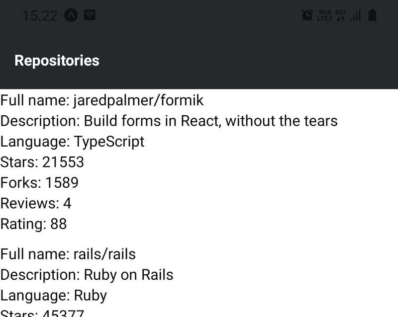
The background color of the app bar in the image is #24292e but you can use any other color as well. It might be a good idea to add the app bar's background color into the theme configuration so that it is easy to change it if needed. Another good idea might be to separate the app bar's tab into a component like AppBarTab so that it is easy to add new tabs in the future.
Exercise 10.5: polished reviewed repositories list
The current version of the reviewed repositories list looks quite grim. Modify the RepositoryItem component so that it also displays the repository author's avatar image. You can implement this by using the Image component. Counts, such as the number of stars and forks, larger than or equal to 1000 should be displayed in thousands with the precision of one decimal and with a "k" suffix. This means that for example fork count of 8439 should be displayed as "8.4k". Also, polish the overall look of the component so that the reviewed repositories list looks something like this:

In the image, the Main component's background color is set to #e1e4e8 whereas RepositoryItem component's background color is set to white. The language tag's background color is #0366d6 which is the value of the colors.primary variable in the theme configuration. Remember to exploit the Text component we implemented earlier. Also when needed, split the RepositoryItem component into smaller components.
Routing
When we start to expand our application we will need a way to transition between different views such as the repositories view and the sign-in view. In part 7 we got familiar with React router library and learned how to use it to implement routing in a web application.
Routing in a React Native application is a bit different from routing in a web application. The main difference is that we can't reference pages with URLs, which we type into the browser's address bar, and can't navigate back and forth through the user's history using the browser's history API. However, this is just a matter of the router interface we are using.
With React Native we can use the entire React router's core, including the hooks and components. The only difference to the browser environment is that we must replace the BrowserRouter with React Native compatible NativeRouter, provided by the react-router-native library. Let's get started by installing the react-router-native library:
npm install react-router-nativeNext, open the App.js file and add the NativeRouter component to the App component:
import { StatusBar } from 'expo-status-bar';
import { NativeRouter } from 'react-router-native';
import Main from './src/components/Main';

const App = () => {
  return (
    <>      <NativeRouter>        <Main />      </NativeRouter>      <StatusBar style="auto" />    </>  );
};

export default App;
Once the router is in place, let's add our first route to the
import { StyleSheet, View } from 'react-native';
import { Route, Routes, Navigate } from 'react-router-native';
import RepositoryList from './RepositoryList';
import AppBar from './AppBar';
import theme from '../theme';

const styles = StyleSheet.create({
  container: {
    backgroundColor: theme.colors.mainBackground,
    flexGrow: 1,
    flexShrink: 1,
  },
});

const Main = () => {
  return (
    <View style={styles.container}>
      <AppBar />
      <Routes>        <Route path="/" element={<RepositoryList />} />        <Route path="*" element={<Navigate to="/" replace />} />      </Routes>    </View>
  );
};

export default Main;
That's it! The last Route inside the Routes is for catching paths that don't match any previously defined path. In this case, we want to navigate to the home view.
Form state management
Now that we have a placeholder for the sign-in view the next step would be to implement the sign-in form. Before we get to that let's talk about forms from a wider perspective.
Implementation of forms relies heavily on state management. Using React's useState hook for state management might get the job done for smaller forms. However, it will quickly make state management for more complex forms quite tedious. Luckily there are many good libraries in the React ecosystem that ease the state management of forms. One of these libraries is Formik.
The main concepts of Formik are the context and the field. However, the easiest way to do a simple form submit is by using useFormik(). It is a custom React hook that will return all Formik state and helpers directly.
There are some restrictions concerning the use of UseFormik(). Read this to become familiar with useFormik()
Let's see how this works by creating a form for calculating the body mass index:
import { Text, TextInput, Pressable, View } from 'react-native';
import { useFormik } from 'formik';

const initialValues = {
  mass: '',
  height: '',
};

const getBodyMassIndex = (mass, height) => {
  return Math.round(mass / Math.pow(height, 2));
};

const BodyMassIndexForm = ({ onSubmit }) => {
  const formik = useFormik({
    initialValues,
    onSubmit,
  });

  return (
    <View>
      <TextInput
        placeholder="Weight (kg)"
        value={formik.values.mass}
        onChangeText={formik.handleChange('mass')}
      />
      <TextInput
        placeholder="Height (m)"
        value={formik.values.height}
        onChangeText={formik.handleChange('height')}
      />
      <Pressable onPress={formik.handleSubmit}>
        <Text>Calculate</Text>
      </Pressable>
    </View>
  );
};

const BodyMassIndexCalculator = () => {
  const onSubmit = values => {
    const mass = parseFloat(values.mass);
    const height = parseFloat(values.height);

    if (!isNaN(mass) && !isNaN(height) && height !== 0) {
      console.log(`Your body mass index is: ${getBodyMassIndex(mass, height)}`);
    }
  };

  return <BodyMassIndexForm onSubmit={onSubmit} />;
};

export default BodyMassIndexCalculator;
This example is not part of our application, so you don't need to add this code to the application. You can however try it out for example in Expo Snack. Expo Snack is an online editor for React Native, similar to JSFiddle and CodePen. It is a useful platform for quickly trying out code. You can share Expo Snacks with others using a link or embedding them as a Snack Player on a website. You might have bumped into Snack Players for example in this material and React Native documentation.
Exercise 10.8
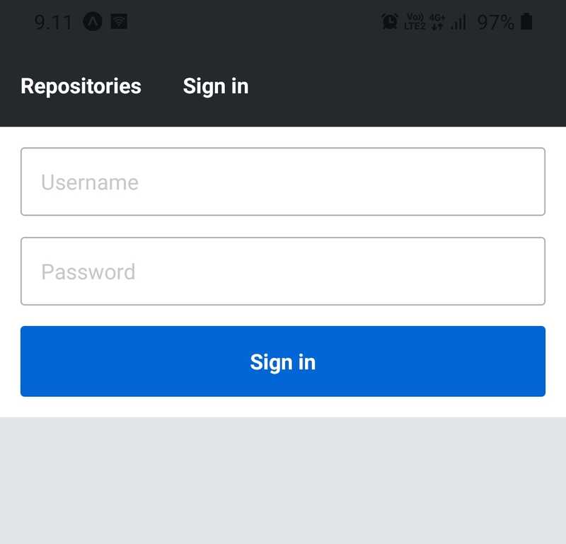
Exercise 10.8: the sign-in form
Implement a sign-in form to the SignIn component we added earlier in the SignIn.jsx file. The sign-in form should include two text fields, one for the username and one for the password. There should also be a button for submitting the form. You don't need to implement an onSubmit callback function, it is enough that the form values are logged using console.log when the form is submitted:
const onSubmit = (values) => {
  console.log(values);
};
The first step is to install Formik:
npm install formikYou can use the secureTextEntry prop in the TextInput component to obscure the password input.
The sign-in form should look something like this:
Form validation
Formik offers two approaches to form validation: a validation function or a validation schema. A validation function is a function provided for the Formik component as the value of the validate prop. It receives the form's values as an argument and returns an object containing possible field-specific error messages.
The second approach is the validation schema which is provided for the Formik component as the value of the validationSchema prop. This validation schema can be created with a validation library called Yup. Let's get started by installing Yup:
npm install yupNext, as an example, let's create a validation schema for the body mass index form we implemented earlier. We want to validate that both mass and height fields are present and they are numeric. Also, the value of mass should be greater or equal to 1 and the value of height should be greater or equal to 0.5. Here is how we define the schema:
import * as yup from 'yup';
// ...

const validationSchema = yup.object().shape({  mass: yup    .number()    .min(1, 'Weight must be greater or equal to 1')    .required('Weight is required'),  height: yup    .number()    .min(0.5, 'Height must be greater or equal to 0.5')    .required('Height is required'),});
const BodyMassIndexForm = ({ onSubmit }) => {
  const formik = useFormik({
    initialValues,
    validationSchema,    onSubmit,
  });

  return (
    <View>
      <TextInput
        placeholder="Weight (kg)"
        value={formik.values.mass}
        onChangeText={formik.handleChange('mass')}
        onBlur={formik.handleBlur('mass')}
      />
      {formik.touched.mass && formik.errors.mass && (
        <Text style={{ color: 'red' }}>{formik.errors.mass}</Text>
      )}
      <TextInput
        placeholder="Height (m)"
        value={formik.values.height}
        onChangeText={formik.handleChange('height')}
        onBlur={formik.handleBlur('height')}
      />
      {formik.touched.height && formik.errors.height && (
        <Text style={{ color: 'red' }}>{formik.errors.height}</Text>
      )}
      <Pressable onPress={formik.handleSubmit}>
        <Text>Calculate</Text>
      </Pressable>
    </View>
  );
};

const BodyMassIndexCalculator = () => {
  // ...
Be aware that you need to include these Text components within the View returned by the form to display the validation errors:
 {formik.touched.mass && formik.errors.mass && (
  <Text style={{ color: 'red' }}>{formik.errors.mass}</Text>
 )}
{formik.touched.height && formik.errors.height && (
<Text style={{ color: 'red' }}>{formik.errors.height}</Text>
)}The validation is performed by default every time a field's value changes and when the handleSubmit function is called. If the validation fails, the function provided for the onSubmit prop of the Formik component is not called.
Exercise 10.9
Exercise 10.9: validating the sign-in form
Validate the sign-in form so that both username and password fields are required. Note that the onSubmit callback implemented in the previous exercise, should not be called if the form validation fails.
The current implementation of the TextInput component should display an error message if a touched field has an error. Emphasize this error message by giving it a red color.
On top of the red error message, give an invalid field a visual indication of an error by giving it a red border color.
Here's what the sign-in form should roughly look like with an invalid field:
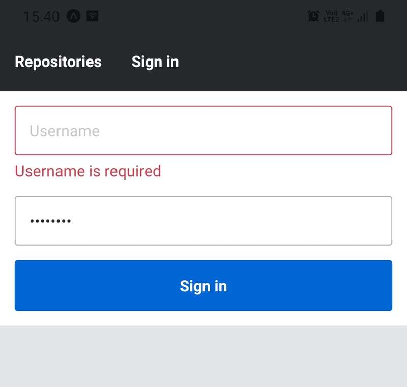
The red color used in this implementation is #d73a4a.
Platform-specific code
A big benefit of React Native is that we don't need to worry about whether the application is run on an Android or iOS device. However, there might be cases where we need to execute platform-specific code. Such cases could be for example using a different implementation of a component on a different platform.
We can access the user's platform through the Platform.OS constant:
import { React } from 'react';
import { Platform, Text, StyleSheet } from 'react-native';

const styles = StyleSheet.create({
  text: {
    color: Platform.OS === 'android' ? 'green' : 'blue',
  },
});

const WhatIsMyPlatform = () => {
  return <Text style={styles.text}>Your platform is: {Platform.OS}</Text>;
};
Possible values for the Platform.OS constants are android and ios. Another useful way to define platform-specific code branches is to use the Platform.select method. Given an object where keys are one of ios, android, native and default, the Platform.select method returns the most fitting value for the platform the user is currently running on. We can rewrite the styles variable in the previous example using the Platform.select method like this:
const styles = StyleSheet.create({
  text: {
    color: Platform.select({
      android: 'green',
      ios: 'blue',
      default: 'black',
    }),
  },
});
We can even use the Platform.select method to require a platform-specific component:
const MyComponent = Platform.select({
  ios: () => require('./MyIOSComponent'),
  android: () => require('./MyAndroidComponent'),
})();

<MyComponent />;
However, a more sophisticated method for implementing and importing platform-specific components (or any other piece of code) is to use the .ios.jsx and .android.jsx file extensions. Note that the .jsx extension could also be another extension recognized by the bundler, such as .js. We can for example have files Button.ios.jsx and Button.android.jsx which we can import like this:
import Button from './Button';

const PlatformSpecificButton = () => {
  return <Button />;
};
Now, the Android bundle of the application will have the component defined in the Button.android.jsx whereas the iOS bundle the one defined in the Button.ios.jsx file.